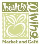
The New Healthy Living Logo!
A logo is a powerful way for any company to express who and what they are. At Healthy Living, our logo has changed several times over the past 30 years. You’ll read about the history and evolution of the design, but first….drum roll…our wonderful, new logo.![]()
After close to a year in development, we present our new apple, a clear evolution from our previous logo but with thicker, cleaner lines and a super easy-to-read word mark, created by renowned logo designer Aaron Draplin. We needed something that included our whole name which has changed over the years to “Healthy Living and Cafe ” and was readable both from a distance on our signage and also up close on smaller things like social media ads, receipts and in-store signage. We wanted a logo that retained the fun aspect we want to convey, and speak to the fact that we’re a natural foods supermarket selling the best local, organic, and natural products. We’re proud of the work and where the logo will take us!
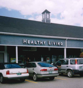
Almost 30 years ago, our logo was non-existent. We had a nondescript sign over our store at 150 Dorset Street, that simply said, “HEALTHY LIVING.” When I realized we were getting about three customers a day shopping at our store, I started to wonder if anyone understood what “HEALTHY LIVING” was. Was it a doctor’s office? A nutritionist business? Psychotherapy? It was definitely unclear.
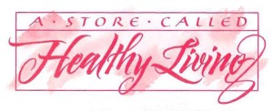
So we worked with a calligrapher on what was to become our first logo. And the name of the store changed too: “A STORE CALLED HEALTHY LIVING” which at least told the world that we were a store where they could buy things!
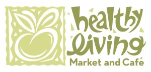
Years later, we worked with a local artist to come up with the next generation of our logo. Tony Sini designed a fun, funky, totally unique logo that fit the vibe and energy of Healthy Living and we loved it for years.
Now it’s time to change it up again. Like the companies we’ve recently read about who have changed their logos, Healthy Living is always adapting and progressing. A willingness to change and be flexible is one of our core values, so this evolution feels right.
![]()
![]()
A Quote from Aaron:
“It’s rare when I get to work for a family business. All too often, I’m dealing with layers of bureaucracy and jaded marketing people. With Healthy Living, from the very first phone call, the Lesser-Goldsmith family took me in and trusted me with something very special: A reinvigorated logo that would be representing 30 years of incredible service to their community. Instantly, this logo took on a special quality. Sometimes logos can be so cold. As we wrap this logo up, it’s still warm, and will be for a long, long time to come. Very, very proud to contribute to such a cool family, and, business. -Aaron James Draplin, Draplin Design Co.”
Posted in: Blog, Uncategorized